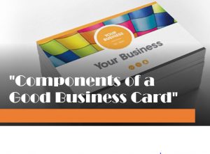
A business card is not a memoir or biography of you. No one cares how great you are, how long you’ve been in business, your great service, and empty promises, no one believes anyway.
For any of you advertising to be successful it must answer one very important question in the mind of the reader…
WIIFM?
What is in it for me?
In other words, who cares?
If it doesn’t answer this question, your cards are almost worthless. You have a nano second to capture the prospects attention, and if you fail the cards will hit the trash as soon as you leave.
Fancy graphics, your photo and any words that don’t contribute to answering WIIFM is a waste of space.
There is only one purpose of a card, sign, letter, ad or most any other media. It’s not to sell anything… It’s to get the phone to ring.
Here are some common mistakes I see at every Quick Start School when I critique cards:
Don’t answer WIIFM: Leaving no reason to call. Many cards are worded so poorly you can’t tell what business they’re in, much less have a reason to call.
Too hard to read: Caused by a poor card design, with the wrong font, poor color choices or small print. All fatal flaws.
No Headline: Which is a unique selling proposition, USP, answering WIIFM. An example is … “I BUY HOUSES.” This header is the grabber that stops the eyeball. Your name is not a headline. No one cares.
Using Company Name: It would seem to make sense, but I believe it does more harm than good. People prefer to deal with people. They want relationships not sales pitches. Companies are intimidating. If a couple works the business, I’d use … “John and Mary Buys Houses Full Price for Your House”, is becoming a popular USP and indicates you’re not trying to steal the house.
Driving to a Website: It may be to your detriment. You can’t buy a house without talking to the seller. Persuading them to a website may scare them off and certainly delays the human contact by phone. I don’t want any delays. I’d use 4 phone number only that goes to PatLive.com/RonLeGrand. They’ll give you six free numbers in your area code and they answer 24 hours. If you do this, make sure you put “24 hours” after your number, I have no problem including your email address on the card for those who’d rather use it, you simply email back and ask for their phone number and a good time to call.
Leaving the Back Blank: Simply wastes half the card that should be used to display your message or offer.
Ugly Color Choices: It is common. Let a pro design your card so it pops and grabs attention. I use Christy King at YellowLetterLady.com. She does all kinds of printing and has samples.
Consider a Double-Sided Tent Card: It is a double card folded with plenty of room to display the benefits. I’d have the lettering on the back raised so when it’s in hand, you can feel the letters forcing you to read the back. I’ve always used day glow orange. You can also use the back for an offer. Example: “$25 Gift Card to Olive Garden when I visit your home.” Remember, you don’t visit the house without pre screening it first, so you’ll only give away a few a month.
The cost of the cards is irrelevant. A cheap card no one calls is a waste of money. An expensive card that generates calls could make you six figures on one deal.
Of course, if you have them in the box you can save money. Give them out everywhere you go. Put one in the envelope when paying local bills. Add one to your checks folder in restaurants.
Let the world know what you can do and give them a reason to call.
Ron LeGrand


Great discussion for using these when looking for and buying houses. Short and to the point. As always, thanks for the heads up.
Some of us “ME” need visuals to help us decide how our cards should look. I’m not sure what todo to create a card. Having my photo on my card is a challenge for me to get my head around.
Thank you,
Nathan Brewer